Category PowerBI
Types of scatterplot: Markers for conditional formatting: Clusters in scatterplot: Clusters for country: Hidden relation: Visual bar chart: Creating combined axis chart: Ribbon chart: Scale to fit: Small Multiples:
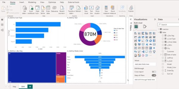
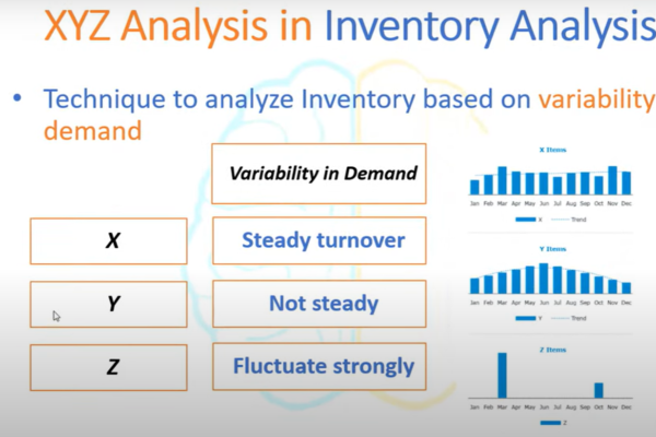
Power BI Inventory Management Dashboard: Supply Chain Analytics Modelling in PowerBI: General Calculation: Specific calculation: Revenue vs Revenue by orderDate: Power BI Inventory Management Dashboard: Power BI Inventory Management includes ABC Inventory Classification, XYZ Classification, Inventory Turnover Ratio, Calculation of… Continue Reading →
Dashboard-2: Get data from Excel to the database: DAX query to highlight highest: Power query to extract Max and min date: Dax measure: Monthly Disbursement for last month: Portfolio at risk: Invalid loans report: Grouping the table based on a… Continue Reading →
KPI’s as DAX measures for winning measures: CALCULATE used to calculate the number of matches.COUNTROWS counts the number of rows essentially counting the total number of matches in the dataset.a condition or filter is applied to checks if the “toss_winner”… Continue Reading →
Understanding Cardinality: In our data, we have a relationship between country table and sample table using the country field. The country table in the first model have unique values for the respective fields. However, sample table have each value repeating… Continue Reading →
Power Query Editor is a data transformation and cleansing available in power BI. Performing data transformations: Split the columns into seperate columns based on delimiter Unpivot columns: Unpivoted Columns: Replace Value: String data cleaning: Age calculation: Adding conditional column: By… Continue Reading →
Dashboard: Dax expression: Slicer:To exclude row by row in slicer France Sales = calculate(sum(Sales_data[Sales Amount]), ‘Sales Territory_data'[Country] = “France”, ALL(Sales_data)) Non_france aus sales = CALCULATE(SUM(‘Sales_data'[Sales Amount]), … Continue Reading →
Creating a master data by DAX: Excel.Workbook([Content], true) Scatter and bubble charts: A scatter chart shows the relationship between two numerical values. Conditional formatting: Not summarised: Clustering: In PowerBI, clustering is used to create a new column in a dataset… Continue Reading →


